Gestalt at second sight
I found the Gestalt principle quite challenging to apply to my art this week. I do not consciously manipulate positive/negative space, play with juxtaposition or ambiguity.
"People are accustomed to seeing the background as passive and unimportant in relation to a dominant subject." (Lupton)
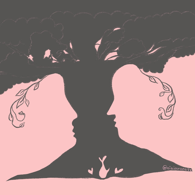
I created "Gestalt at second sight" using the app Procreate on my iPad using the 6B Pencil and Script Calligraphy Brush. The two colors I chose are pink and grey -- I deviated from using black and white like typical negative space art. This pink tone is becoming a key component of my artwork and I replaced black with grey because I didn't desire the stark contrast it would've brought to my art. As always, the artwork is linked to its respective post on my Instagram. Give me a follow there to keep in touch and support me on both platforms.
The first thing you come to notice is actually the background which pops out -- the two people looking at each other. This is a unique aspect because often my art only has the background as a layer of color; as opposed to an image made by the layer above it by manipulation of space. The text really helped me extract the eye contact of two people using the trunk of the tree. Furthermore, the fish diving back into the water along with the splashes of water show three hearts in the background carved through the tree trunk. This creates continuity between the two people and the water as part of the background. Moving the eyes to the top of the art, which is heavily filled with bushes of leaves and branches -- it is inferred the sky is what's peeking through the gaps of the branches. Lastly, we see very wispy branches with leaves ambiguously forming ears for the two people -- juxtaposing the solid figures creating the rest of the art, it's hard not to notice these wispy branches.
Please let me know in your comment what you saw first in "Gestalt at second sight".
This art was heavily influenced by this art.
Excerpt from Graphic Design by Ellen Lupton.


I like how you used the color pink. It speaks volumes about your personality and who you are. I really like the idea of the two people becoming the tree. To me it is a wonderful symbol of collaborative growth. You did such a great job! Love you blog, as always!!
ReplyDeletevery moving image, found myself lost in all the details you placed within. They all combine to tell a beautiful profound narrative. I thoroughly enjoyed your connection to the theme and enjoyed your interpretation
ReplyDelete